The modern kitchen is equal parts living, dining and cooking areas. It has evolved from the engine room of the home a space, where everyone congregates. So why, when we spend lifetimes putting together the look of our homes, investing in art, the right furniture and even getting bespoke paint colours mixed to invoke certain memories, do so many of us shortchange our aesthetic and buy an off-the-shelf kitchen that is exactly the same as thousands of others?
Architectural writer Phyllis Richardson, author of Real Homes, believes part of the reason is our need to keep up with the Jones's. She says we should stop being seduced by kitchens in brand brochures, the interior equivalent of catwalk models that are shot in warehouses many times the size of the average house. Just as clothes on real people don't look quite the same, the end result looks decidedly different in a real home.
For her a kitchen should be workable, family friendly and versatile – a place you are drawn to. She credits the rise in the popularity of cookery programmes as the reason we now congregate there. “If you’re going to spend more time cooking in the kitchen, then other people – your children, your partner, your guests – are going to want to be nearby too,” she advises.

Rethink the idea that you have to shoehorn your plans into a designer’s totally coordinated and unrealistic scheme, she says. “It’s about not throwing away the personality and personal effects, the things that have meaning that give character to a kitchen, that make the space feel a little bit more relaxed, like a home,” she explains.
“It doesn’t have to be trendy or fashionable. It can be inspired by art, history or tradition like quirky pots or odd crockery.”
A hyper-minimal space, without any evidence of food being cooked or a dish being washed is not what we’re after here, she concludes.
Here are some ideas to try at home.
Real Homes is written by Phyllis Richardson, with photographs by Solvidos Santos and published by Thames and Hudson
‘A large eat-in space where everything in our hourse happens’
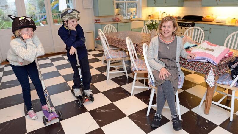
Mother-of-two Jane Carroll likes things that are not part of a trend, so her kitchen reflects her own design aesthetic.
“It’s a large eat-in space where essentially every- thing in our house happens. I chose cupboard doors that can be painted. Mine have been three different colours so far. The cupboards are currently painted a strong blue, Farrow and Ball’s Blue Ground,” says Carroll.
Funky cushions
"The timeless black and white checkerboard porcelain tiles were bought in TileStyle. The long dining table forms many functions. It is a homework hub and a place for me to work and is long enough that I don't have to clean up when we want to sit down to eat. I have a collection of vinyl tablecloths that I use sometimes to completely change the look.
“The Argos chairs are very simple white forms that look nice and fresh against the floor and the blue cupboards. I have some funky cushions that I use to brighten them up.
"A few of my favourite things include a clock that I made with drawings of all the kids in my son, Will's class, a funky toaster and some Orla Kiely storage jars. Over the summer the fridge packed in, so I now have a new cream retro-style instead.
"I have dimmer switches on all the lights, so that overhead lighting can be dimmed at night for entertaining. I also have a working fire which helps to make it cosy in winter."
janecarrolldesign.com


