If you ever doubted how seriously big companies take their branding, and how much time, effort and money they invest in making things just so, then look no further than Ikea’s latest exercise in rebranding.
The company has just unveiled a new logo that, it hopes, will “futureproof it in a digital world” – but you would need a very, very keen eye for detail, and the ability to find every Wally in the book in the time it takes the Angelus bells to ring, to notice the differences between Ikea’s new and old looks.
"We wanted to maintain the unique characteristics of the original iconic design but make subtle yet impactful changes... for a better experience across all formats," said Seventy Agency, the company charged with refreshing the Swedish furniture giant's logo. It added that Ikea's blue and yellow colours "will take on a larger branding role, aiding the experience of Ikea in current and new meeting points".

No, we’re not entirely sure what that means either.

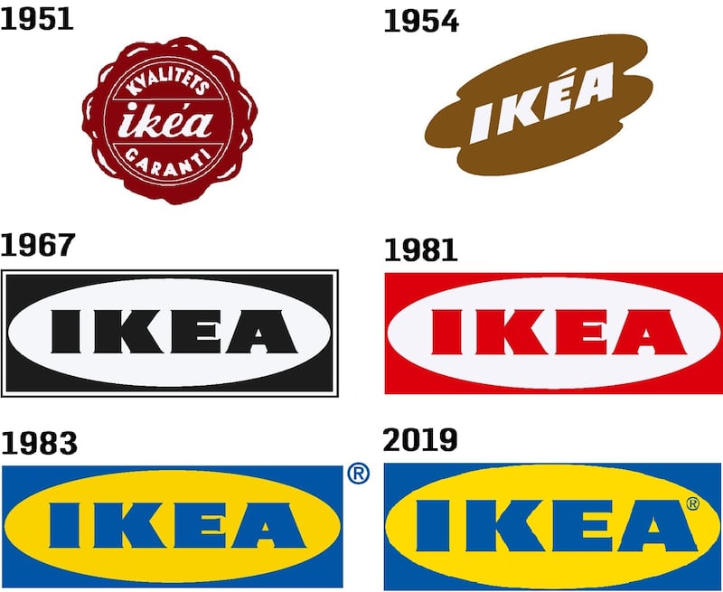
So what did they actually do? They moved the registered-trademark symbol from its spot outside the box in which the Ikea logo has been happily sitting for decades to a spot inside the box, much closer to the A. They also made the company’s name slightly larger and tweaked the edges of some of the letters in a way the untrained eye would struggle to notice.
Helpfully, the graphics website Brand New has published some before-and-after illustrations, as well as a dazzlingly coloured gif, so design nerds can see what the company has done and why it matters.
“It is a small change that is more of a refinement” to ensure it is “easy to recognise at all times,” Ikea says. Its logo “has basically looked the same since the mid-60s, while shopping patterns and media consumptions have changed... This puts new demands on functionality of logotypes in general.”


