
As a designer, colour is one of the most powerful tools at your disposal. It is a vital component in creating the right atmosphere in a room or space, and has such an important role to play in our homes it is no surprise that so many of us are fearful of using or even experimenting with it.
I often give talks on colour and when introduced as an architect I notice many in the audience looking rather concerned – “am I in for a presentation on the colour white and its many, many uses?” But I’m not a typical architect.
Colour is not something architecture students are taught in college and the result is many architects are as terrified of using colour as their clients. It has such an impact on the spaces we inhabit that it really should not be an afterthought but should form part of the initial vision.
There is a quote from Claude Monet: "Colour is my day-long obsession, joy and torment". This sums up the fact that there is a certain amount of trial and error when it comes to choosing the right colours, even for the colour masters. So don't be afraid to experiment and test things – through mistakes we learn.
Whether or not a colour will work in a particular room depends on a number of factors – the orientation, the flooring, the furnishings and the lighting. For example, if your woodwork and windows are white or off-white, you will be able to choose from a vast range of colours as opposed to someone who has teak windows where the options will be much more restricted.
If you’ve got patterned upholstery, an Oriental rug or large piece of artwork, pluck colours you like from the pattern. Art is a fantastic place to start if you are looking for inspiration. Pulling shades for your colour scheme from a painting that you plan to hang in the room will create a really cohesive look.
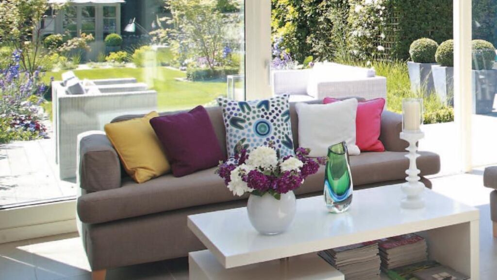
Inspiration can come from anywhere, fashion, film, art galleries or nature. Recently, a client had a very neutral kitchen and living space which opened on to her garden. We selected a mix of plain coloured cushions to pick up the colours of the flowers outside and the effect was beautiful and connected the living space with the garden.
If you are nervous about using colour and are trying to plan a scheme, try working with a tonal palette. This is where you select only one shade but use varying tones of it throughout a room. By using darker and lighter shades of a colour rather than just painting the room in one shade you will avoid the scheme being bland. Keep your woodwork and ceilings the same colour and aim for contrast with your wall shade, by following these guidelines the colours will appear more considered.
Denise O’Connor is an architect and design consultant