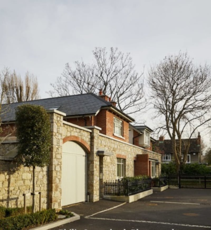
Most people who move into a freshly decorated new home sit back and enjoy the fact that the work has all been done, but not the owner of this recently built and decorated mews style house in Dublin. The house was in walk-in condition when it was bought by the owner, who is in her 40s. The exterior of the new build referenced arts and crafts, and the interior had been given a complete fit-out by the builder. But it wasn’t to her taste and so it had to go.
"The interior spec was not quite up to the quality of the house itself," says designer Jane Higgins, who was employed to make the house more stylish and elegant. "The interior looked quite old fashioned; it just didn't reflect her personality and youthfulness."
Higgins describes how the house was decorated with traditional-style yellow flock wallpaper, inauthentic ceiling roses, shiny grey carpeting, florid fireplaces and dark floors in the hall.
The remit was to "strip out the fussiness and traditional décor, and make it more elegant", says Higgins. So out came elements including the fireplaces, carpets and hall floor – all of it given to people who did like it – and in went the well-heeled, design-aware, middle-class go-to brands; including Bo Concept, Farrow & Ball, The Rug Company and Roche Bobois.
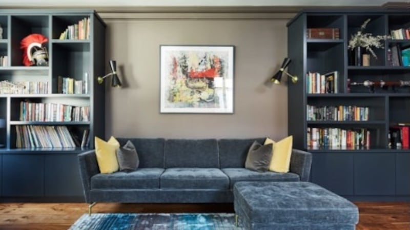
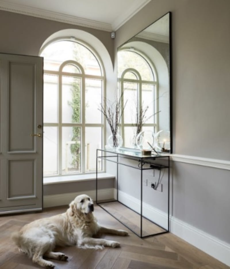
Although the dark flooring was removed from the hall (to be replace by limed oak parquet), the designer and owner were not averse to deep shades and opted for the dramatic, blue-rich black Railings by Farrow & Ball in the front living room. This was to be the owner’s television-free sanctuary and a place to be with friends.


"Everything looks great against that dark background," says Higgins. Among the elements chosen to be framed by the inky blue backdrop are a limestone fireplace with a simpler shape than the fit-out version, a sofa and armchairs from Roche Bobois, lighting by Bert Frank, coffee tables by Gallotti & Radice, the Italian classy glass company, and a rug by The Rug Company, whose products are all handwoven and created by designers such as Paul Smith. Higgins is used to keeping her nerve when waiting for furniture to arrive from abroad and overseeing expensive pieces being assembled on site (some of which proved to be complicated). "It's all part of the job," she smiles.
Having drawn on these French, Italian and UK companies – with some pieces spotted on Higgins’s annual trip to the Maison et Objet fair in Paris – she turned to Irish designer Aoife Mullane to create cushions to tie the look together. “Aoife does gorgeous work, offering a personal service to design the best solution for the room.”
Teenspace
The room beside this, for teenaged offspring, kept to the art of dark with a warm grey wall and navy blue built-in storage, incorporating lighting, designed by Higgins. The existing fireplace went, to be replaced by a cool wall-mounted, flush-fit fire. A piano sets the tone of the room which caters for musical teens in a space with a light fitting that abstractly resembles trumpets. The adolescents even get their own entrance from outside to give them some independence.
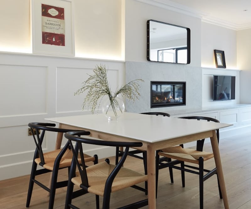
While the existing kitchen, at basement level, was kept, it was painted white and the handles were changed: "To lose the country kitchen look," says Higgins. The rustic vibe was further eliminated with a pop of colour in cherry stools by Gubi, chairs that recall the Hans Wegner classic Wishbones, from CA Design in Ranelagh, Dublin, and a dining table from Bo Concept.


Shelves in an adjacent office and living room echo those in the kitchen to co-ordinate the spaces. A fireplace in this living room was also taken out to be replaced by a wall-mounted one. In this below-ground space, Higgins has used white everywhere to make the most of natural light streaming in through floor-to-(nearly)ceiling glazed doors.
“The brief grew as the project went on,” says Higgins. “It is a bit like buying a new outfit; then you want the new shoes and new handbag. She [the client] got more and more into it as we went along. It was a collaborative process and her taste very much mirrored my own. She was great to work with and open to new ideas. She agreed to go for lots of things that I suggested.
“It has been one of my nicer projects. It was a great opportunity to use good brands. We spent 10 months working together and are good friends now. She wanted the house to reflect who she is in the next phase of her life, and she is delighted with it.”


