The owner of this apartment travels for business, staying in New York and London hotels, and he wanted this property to share the five-star vibe, especially as he envisioned renting it out as a corporate let.
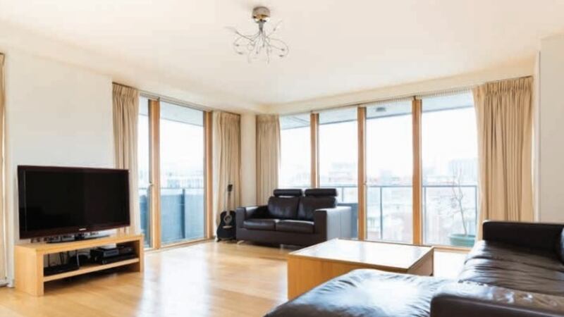
When he bought the seventh-floor apartment in Dublin's Grand Canal Dock it had the standard, generic design that was installed across the whole scheme. Very acceptable pale-and-tangy wooden floors and window frames and cream bathroom and kitchen tiles. The furnishings aligned with the limited palette of black, pale wood and cream. "It was very much a template design," says interior designer Ruth Noble who took the smart-hotel brief and went down the rich route.
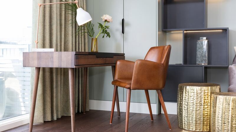

Dark colours, warmth, texture, drama and character were the guiding principles. Out went the pale wooden floors to be replaced by darker ones. "It's not what you would expect in a property like this," says Noble, who used it to make the apartment feel more homely and – with an eye on Irish winters (and indeed summers) – she wanted to add warmth. This extended to the paint colours – all from Little Greene – which included a plum "Adventurer" kitchen and the brownish-red Ashes of Roses shade for the panelling she introduced in the hall (she also panelled the doors).
Designed for feeling
There was no fear of more traditional metals and elements such as brass and copper with a patina (for instance, on door handles and light switches) as well as pieces in leather, velvet, ceramics and wood along with textured wallpaper: “To add character,” says Noble. “It is heavier than you would expect but is designed to bring more feeling.”
Indeed, such traditional, natural materials tend to wear rather than break and so become worn by, and imbued with, human touch over the years and thus are associated with, literally, feeling.
Cream tiles were removed from the bathroom and kitchen, with the first being given upscale, glossy variegated tiles while the kitchen is tiled in dark navy. The hall has small red, white and blue tiles, demarking all three spaces from the wooden floored parts without jarring.
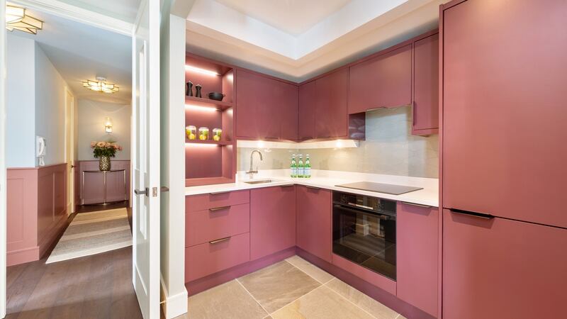
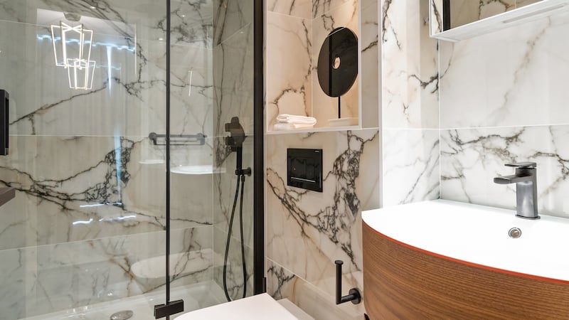

“This scheme is very much about how the rooms link to each other,” says Noble, who has the kitchen colour speaking to the wall panels, and she balances texture – such as the rugs, velvet chairs and sofa, rugged or shiny wallpaper, and varying types of glass lightshades set against softer, plainer fabrics of the sleek kitchen. “I was conscious of what’s being fitted in each room,” says Noble.
The only structural work involved taking down a kitchen wall, linking it better to the hall and on to the living room. Its exposure meant Noble “wanted to create a kitchen that looked good; almost as part of the rooms”.
Added lighting
She added a quartz countertop and backsplash, which was made by a carpenter as were the shelves in the living room. Lights were fitted into both sets of shelves, as part of a layered lighting scheme that upgraded the two-bed apartment from its few pendant lights.
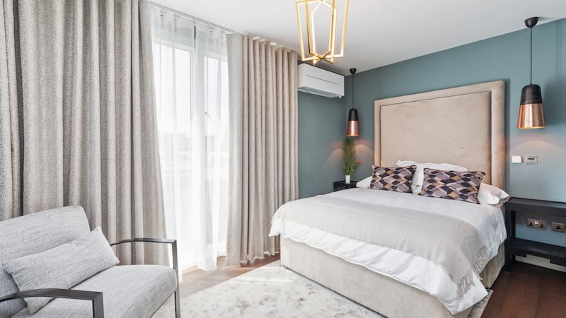
“It was very minimal when we started,” says Noble. She added wall lights in the second bedroom and in the hall, where downlights and pendants were also added, while the main bedroom got extra pendants too.
“The living room was a big issue for the client because there was very little lighting in there,” she says. She put in a mix of functional and ambient lights including three pendants above the dining table, and five-amp desk lamps (including at the desk beside the window).
“If you go into blocks of apartments, the interiors are all similar,” says Noble, “and we wanted to give this its own character.” Indeed, we have become used to modern interiors in period buildings, but, with the addition of panelling, texture and dark colours, Noble has reversed that look by bringing a classical feel to a modern apartment.
Contact book
Paint: Little Greene (various shops countrywide)
Wooden floor: Grain & Groove
Sanitaryware: Davies
Tiles: BTW Sandyford
Curtains: Zimmer + Rohde fabric
Door handles: Turnstyle Designs
Furniture: Available via Ruth Nobel Interiors
Furniture fabrics: Sourced from trade supplier Nordal through Ruth Noble Interiors


