Half a century after the self-publication of Jack Fitzsimons's build-your-own book Bungalow Bliss, the title's success can be seen in every village, town, and suburb in Ireland, as well as in its rolling countryside.
With one-quarter of a million copies of the book sold, the nation took to the build-your-own concept in the hundreds of thousands – figures from the Sustainable Energy Authority of Ireland estimate that there are some 300,000 bungalows populating the landscape, and many of these houses were built by their original owners, taking a very literal approach to homemaking.
Back then the houses were considered the height of modernity. In many instances people decamped from an old farmhouse into the brand spanking new bungalow constructed next door.
In the 50 years since, the house style has been much maligned.
Now, however, the bungalow is making a comeback.
The home won the renovation gong at this year's Irish Construction Industry Awards
Last November, listeners to Joe Duffy’s Liveline lit up its switchboard with complaints about the national broadcaster’s promotion for Hugh Wallace’s TV series My Bungalow Bliss.
It was the use of the term “bog-standard bungalow” in RTÉ’s official promo for the show, which followed homeowners and their architects as they transformed their homes of the titular type, that excised the bungalow brigade.
But even before this broadcast, savvy homehunters were already taking a second look at this humble house type and finding fresh ways to unlock its potential.
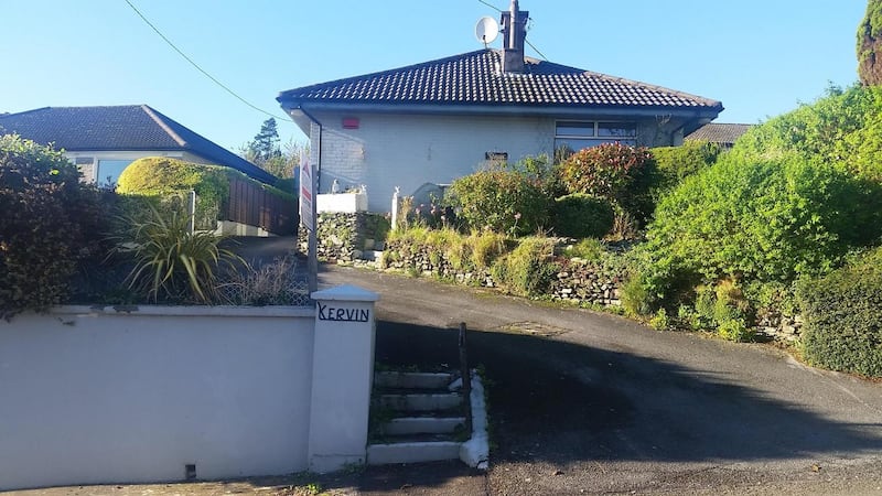
Ronan Conneely and Lizette Wessels of Kinsale-based Conneely Wessels Architects spent about two years looking for a home when they finally clapped eyes on a typical mid-century bungalow model set high on a hill overlooking the Cork town.
While built on an elevated site, about 2m above the road, the single-storey structure wasn’t high enough to frame stellar views of the town’s historic harbour and forts beyond.
They realised they could add a second floor with a simple shape shift, by replacing the home’s pyramid roof with a cube-shaped structure.
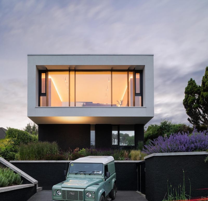
“To get as much floorspace as possible upstairs we wanted to project out,” the couple explain.
The new floor would have a flat roof and remain within the building’s existing ridge height.
The home they bought had been built in 1974, as the 1973 oil crisis was ending. It was constructed by its owner and was a modest 83sq m (893sq ft), the size of a decent-size two-bedroom apartment. “But it had been really well constructed,” says Ronan. The couple are the property’s second owners.
They were able to leave the original concrete foundation in place, cutting down on costs, and laid a damp-proof membrane atop it before adding insulation and underfloor heating. This raised the floors by 20cm.
Completed two years ago, “the works made financial sense”, Ronan says. “We were able to double the size of the house.”
They added 93sq m upstairs, giving them a total of 176sq m in a home that now has an A3 Ber rating.
They added external insulation, like a woolly jumper for the house, as well as internal insulation on the home’s exposed, northeast side. “The better insulation the less heating you need,” Lizette adds.
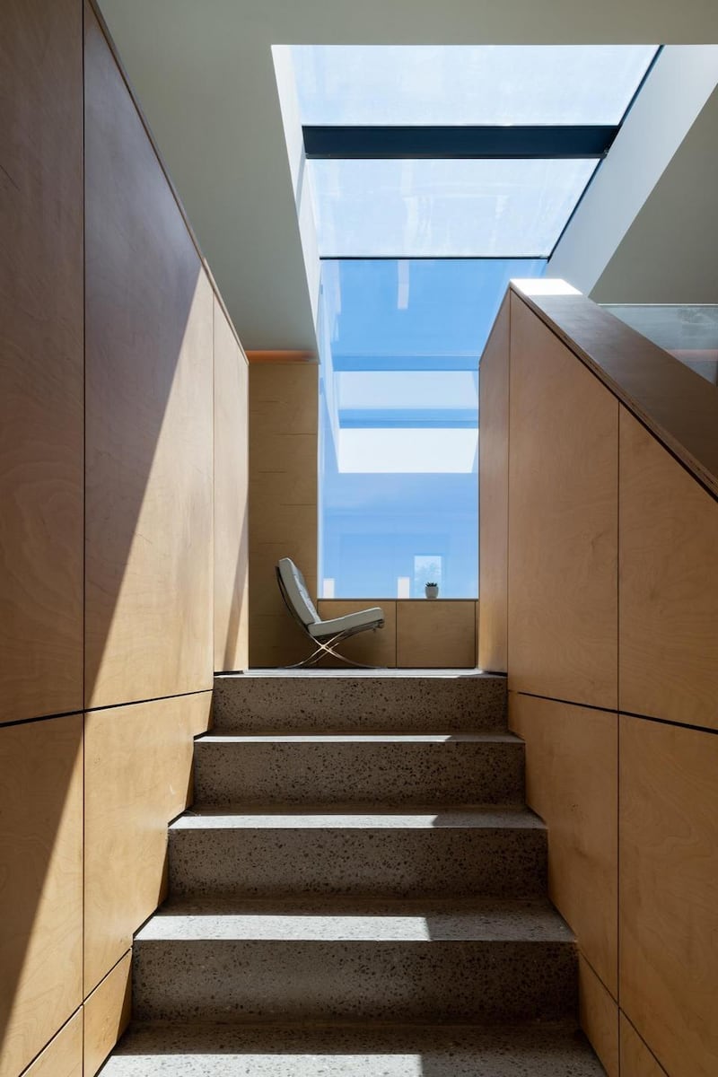
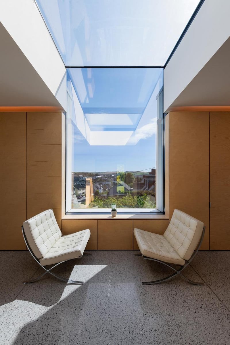
As you climb the stairs the living area is to the left, where its stylish seating is set around a wood-burning stove. A south-facing up and over rooflight has been positioned so as to soak up the sun. This part opens out to the original raised back garden.
On the far side of the glass and plywood balustrade stairs is a large dining area. The table was custom-made for the space using trestle bases they already owned that have been affixed to a plywood top.
When seated here, the working part of the kitchen cannot be seen. “This is by design so guests invited for dinner are not looking at dirty dishes,” Lizette explains.
The kitchen island is hidden from view by a raised perimeter that is clad in the same plywood as the rest of the storage.
“We have lots of stuff,” Lizette says.
With material and labour costs and general inflation all rising, the couple say everyone needs to be smart about how they spend their budget
If they have, there isn’t a single thing on display, for there is plenty of storage here. It’s all hidden behind either the floor-to-ceiling cupboards on the far wall, where they have also installed a bar, or in the cabinets to the front of the island.
The kitchen was customised rather than custom-built, again cutting down on costs. They ordered a Leicht design from House of Design in Midleton. The German brand has top quality engineering, but the couple replaced its door fronts with plywood ones.
Below the ply capping is a black shadow gap, a detail beloved by architects, where there is strip LED lighting that can change the mood in an instant.
On the wall where the sink and induction hob are is a bank of overhead cupboards, whose doors open out and fold back on each other, a smart space-saving detail.

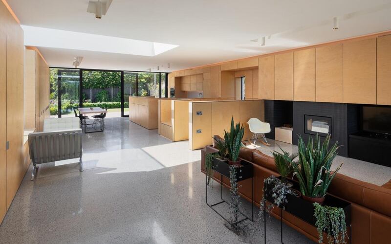
All the cabinet joints also line up. “These are the details that bring that little bit of joy,” Ronan says, only half-joking.
The underfloor heating is operated by an air to water heat pump. The house also has mechanical ventilation. The couple opted for concrete floors, because the material conducts heat really well.
They didn’t want a dark floor, so went with a polished limestone concrete screed throughout. A less polished version has been used on the terrace outside, helping to link the indoors with the exterior. Here, from the BoConcept furniture, there are spellbinding views over the town and right down to the harbour and beyond.
The home’s aluminium windows were made in Cork and make use of a commercial system more typically used on public projects. The large one upstairs spans about 8m and is broken by perpendicular fins that give some privacy by preventing people from looking directly in.
Rendering the top floor in white while painting the ground floor a dark colour means that the latter area disappears into the background, while the upper level appears to float
Retaining the existing window openings at ground level cut down on building costs. They added a single aperture to frame a silver birch tree and dropped the sill level in one to further open it up to the outside. There are three bedrooms, one of which has an en suite, at this level. The front door is also at this level, recessed to shelter you from the rain and wind.
The home won the renovation gong at this year’s Irish Construction Industry Awards.
With material and labour costs and general inflation all rising, the couple say everyone needs to be smart about how they spend their budget. “Spend it where you spend time, so in the livingroom or kitchen, not in the bathroom, so that money doesn’t literally do down the drain,” they counsel.
“We kept the existing structure, foundations and underground drainage. The plumbing is all to one side of the house so that dictated where bathrooms and [the] kitchen would go.”

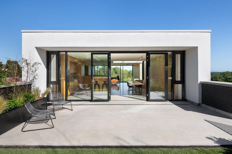
There is a periscope look to the upper floor. Rendering the top floor in white while painting the ground floor a dark colour means that the latter area disappears into the background, while the upper level appears to float.
The surrounding landscaping was a lockdown project, says Ronan. Naturalistic, it includes lots of ornamental grasses; cat mint, which looks like lavender; diorama, also known as angel’s fishing rod; agapanthus, and African daisies, which celebrate Lizette’s South African heritage.
With the house now extending to about 176sq m (1,894 sq ft), they estimate the cost per square metre of the project was about €2,200, which amounts to a hefty €387,000, in addition to the purchase price. Twenty-four months later they have no idea what those same works would cost now, for tenders have shot up.


