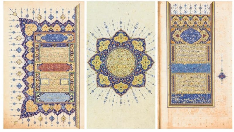
We are accustomed to the Chester Beatty Library producing astoundingly beautiful objects and putting them on display for us to look at – but even by the library's standards, the Ruzbihan Koran is something special. Its pages glow with lapis lazuli and gold, with reds and greens, pinks and desert sands, orange and ice blue.
The text, made in Shiraz circa 1550, was copied by one of the most accomplished master calligraphers at work in 16th-century Persia, the eponymous Ruzbihan. It’s actually pretty astonishing that this 500-year-old manuscript can be displayed at all because, over the course of centuries, one of its jewel-like colours had – silently but relentlessly – been burning its way through the Koran’s priceless pages.
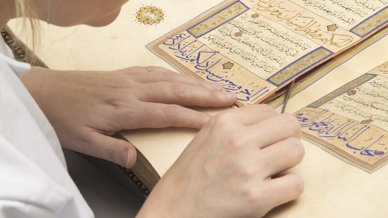
"Around each page is a frame of coloured lines, and one of those lines is a green pigment that is copper-bearing," says Dr Elaine Wright, the library's curator of Islamic manuscripts. The copper content in the paint caused the paper to split along the frame lines, making it impossible to turn the pages without them getting tangled and interlocked.


It's a common problem in manuscripts of the period, and the only way to deal with it is to open up the binding, take the book apart and carry out major conservation work. In 2012, a project began to restore the Ruzbihan Koran – a mammoth task, given that the manuscript runs to some 445 folios, a whopping 890 pages – and more than 50 of these newly conserved pages now form the heart of the exhibition Lapis and Gold.
“One of the fantastic things about this manuscript is the quality of the illuminations,” Dr Wright says. “They would have been the work of a large number of people. To think that they could do this at a time when they didn’t have electric lights – and, at times, using brushes of one hair’s thickness – well, it’s amazing.”
Burst of light
The Koran opens with a burst of light in the form of a pair of full-page shamsas, or suns, surrounded by shimmering rays and filled in with a variety of motifs, from tiny lotus flowers – many of them too small to see with the naked eye, so magnifying glasses will be supplied for the use of visitors – through intricate geometric designs and stylised cloud bands inspired by Chinese art.
Even on the book’s “ordinary” pages, however, the care and attention to detail is mind-boggling.
“See how it shines?” says Wright. “The paper itself is highly, highly burnished. For the panels of large-scale script they first of all decorated it with sprinkles of pink, or pink and gold. Then they wrote the text. For the centre panels, which have smaller script, they wrote the script first and then they put gold sprinkles on top.”
There are more 6,000 verses in the Koran, and the end of each verse is marked by a petal-like shape no bigger than a fingernail.
“For each little petal they’ve taken a sharp tool and made tiny indentations around the contour of the edge so that they’ll catch the light and add to the sense of movement and depth on each page,” says Wright.
Do we know who commissioned this gorgeous object? “We don’t know who it was made for, but it had to have been somebody who was very wealthy and probably highly placed. Even on the simplest page, the cost of all that gold, and the time it would have taken to produce it, is breathtaking. A lot of these manuscripts went to India and the Ottoman lands.”
Dr Wright says the Ruzbihan Koran offers a fascinating glimpse into 16th- century Shiraz, a commercial centre for the production of high-quality illuminated Korans.
“For me what’s really interesting about studying the manuscript is figuring out the process: how they did things, and in what order. It adds a real human element to it. The spacing of the text, for one thing. It’s easy to space out the smaller blocks, but for the larger lines of elaborate script, it’s really tricky. What do you do if you don’t have enough space? In one place you can see where the calligrapher doesn’t have enough words to fill the line, so he’s decided to spread out the last few words. In another place he just left it blank, and then an illuminator came along afterwards and filled it up with decoration.”
“And here” – she indicates a faint line of writing at the very edge of a page – “these are notes which were meant to be cut off when the manuscript was bound, but they missed some of them. So you can figure out what they say. And what they say is the text – so they’re telling the calligrapher exactly what he had to write in each panel.”
What this indicates, she says, is that the calligrapher probably didn’t write the texts in sequence but went through the pages filling in all the large, gold script first. How does she know?
“The different scripts use different pens and different colours of ink,” she says. “To do a page from top to bottom, you’d have to start with your large gold pen, then switch to a small black one, then go to another different large pen with blue ink.
“There are strict rules for how you execute each script, which would mean a constant mental change from one to the other – but also, that constant changing of pens and ink. This is gold and lapis lazuli, the two most expensive materials available at the time, so you don’t want that drying on your pen.”
- Lapis and Gold is at the Chester Beatty Library, Dublin, until August 28th


