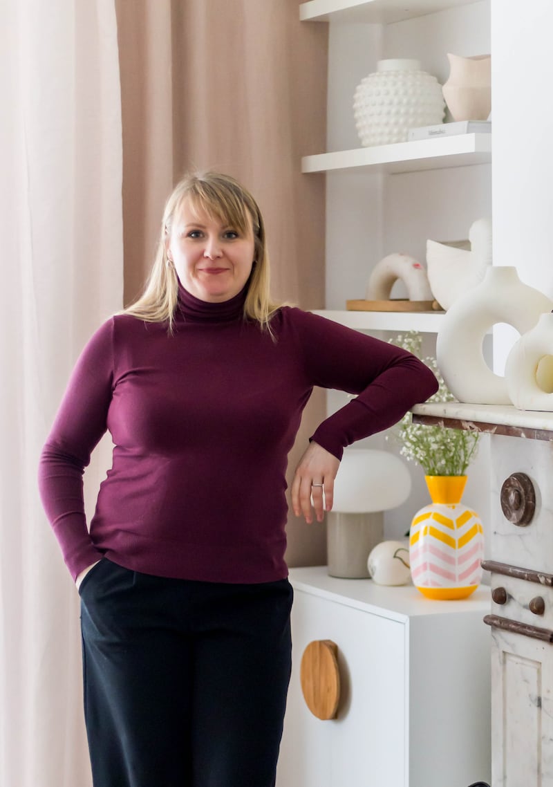
When the owners of an Edwardian property in Dublin 6 were looking to reimagine their home, bringing warmth and colour to the handsome house was a priority. So, they turned to Russian-born interior designer Alena Chikurnikova, better known as Alena C Design, who has lived in Ireland for 12 years, to rethink their home.
“The client wanted it to be joyful and warm, so that it reflected all the family,” Alena explains, adding that functionality is a focus of her work. “She [the client] wanted to declutter so that everything had its place. She also wanted to repurpose as much as was possible.”
Approach
Alena begins the process with a consultation in which she is very sensitive to how people are, she explains. A fan of bringing the concept of dopamine dressing into the home, she takes note of a client’s look, “what they wear, their jewellery and accessories”. It is a more psychological and practical approach, she says, looking at how families communicate and how the household works.
It anchors her approach to decor, she says. “I believe colour brings joy. It is especially essential in Ireland, where we live with up to six months of grey weather,” she explains.
She starts by creating an idea book for each room, a collage of different ideas, with a hint of the same colour palette brought from one space to another. Her client wanted every room to appear warm, light and minimal with a quirky sensibility, she recalls.
Mission accomplished. Using paint to bring in colour, the new chromatic mood mixed bold brush strokes with nuanced washes and made use of much of the existing furniture. Posters and prints that had been collected over the years and languished unseen were hung in every room.
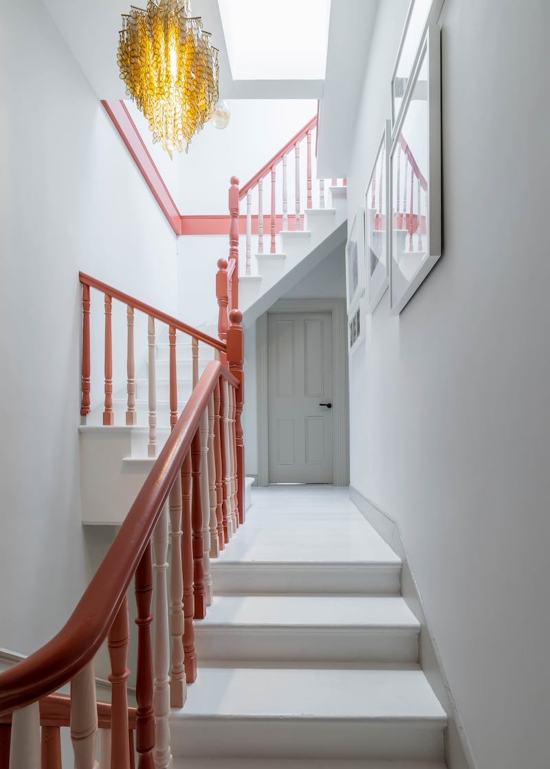
The gear shift starts in the entrance hall, where the banister and balustrades have been painted in four different Colourtrend shades, a tonal range of colours that helps add interest to the staircase.
The rail is painted in Poppy Rose while successive balustrades wear different colours, each upright wearing Poppy Rose, Marble Pink, Angel Breath and Chinese Cherry, a pattern repeated all the way up to the attic.
Underfoot, the steps and treads wear a hard-wearing floor paint from Nordic firm Tikkurila, while machine-washable rugs by Newry-based Kukoon adds warmth. It also means that pets and kids can tramp through the house, bringing in dirt that can be washed out.
The reception rooms interconnect. The box bay space to the front is a sittingroom, its feature window hung with marshmallow pink gauzy linen for privacy, and linen curtains to draw on the dark evenings.
The sofas are from Ikea, favoured for their slim lines and their removable and machine-washable covers – a boon when you have a dog.
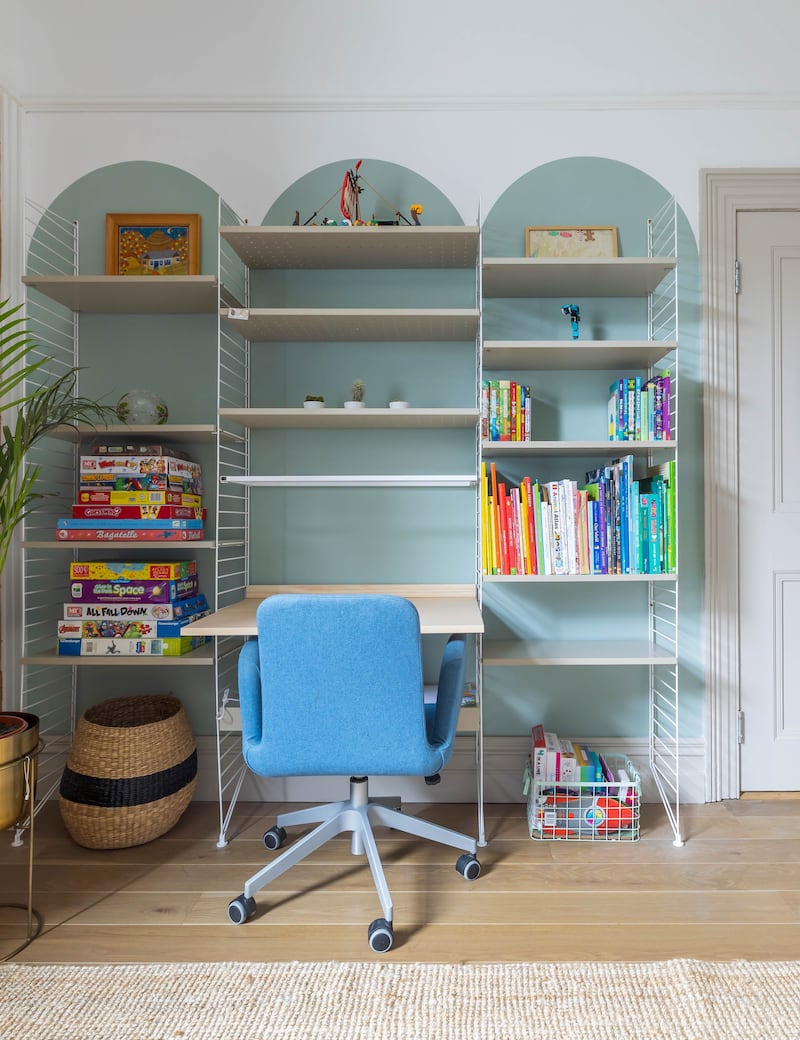
To its rear is a playroom where arches of bluey-green, Mid Peridot by Dulux, frame a String furniture desk. This strong use of painted arches is a recurring theme through the property and an easy way to bring in some bold colour choices.
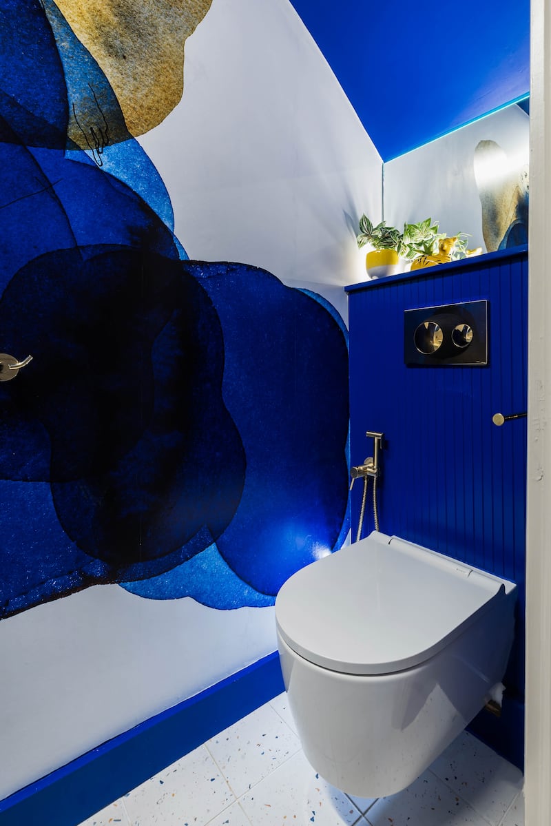
There’s a guest WC under the stairs whose tongue and groove panelling around the cistern is bedecked in Tikkurila navy blue. It is its eye-catching mural by Photowall that dominates the space. A hygiene hose by the WC, in a brass finish has a myriad of uses.

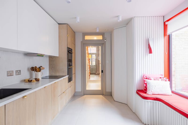
The eat-in kitchen is to the rear. Originally a broken plan shape, it has been opened up, so that there is space for all the units and a dining table.
Alena removed a partition wall and moved some of the glazing, so that the large picture window above the bench is in a place where it lets sunlight stream in. Originally, it had been on the end wall and blocked from view by the partition wall. A smaller square window illuminates the dining area.
Adjoining the kitchen is a laundry cupboard – screened from sight by fluted panelling, as is the adjoining pantry.
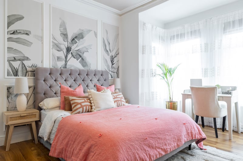
Upstairs, the principal bedroom has a wall mural cut down into three panels above its velvet-upholstered bedhead.
There are more rich infusions of colour in their son’s bedroom, where bespoke bunks have been built into an alcove. He sleeps on the lower bunk, while the upper one has a mattress and cushions where he can lounge with friends and play games or host a sleepover guest. The rope detailing is both decorative and functional, Alena says.
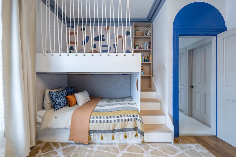
Here, a door and door frame have an arch drawn above in the same deep blue “to highlight the height of the room”. The period coving is picked out in Dulux’s Mouse Moving. “These are colours that he can grow with into his teen years,” she explains.
One of the property’s two more offices features undulating arches of tonally complementary tones from Colourtrend’s palette; Poppy Prose again, used this time in conjunction with Caramel Candy, a toffee apple tone, and Taupe Pink.
“I really like curved shapes as they make a space more interesting,” she explains.
Sizzling hot kitchen ideas
The kitchen’s long shape is now broken into zones with storage mapped out for all aspects of cooking and meals.
Pantry perfection
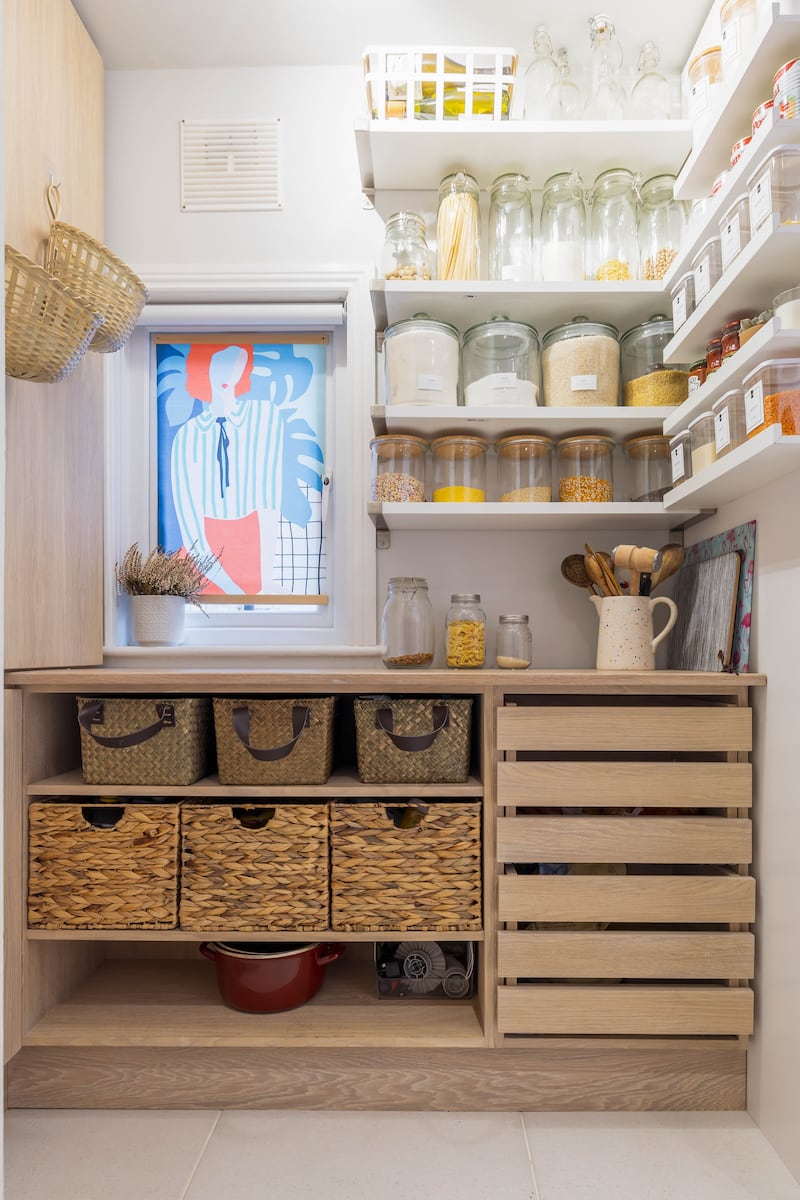
First up is a pantry to the left of the kitchen, concealed behind a pocket sliding door. It has slatted drawers to keep vegetables fresh and lots of shelving filled with glass and Kilner-style filled pulses, grains and flours. A fabric print, found in Pull and Bear, and put on to battens, hides the window and shields the space from the side passage outside. It is pantry porn perfect.
Extra counter space that pops up
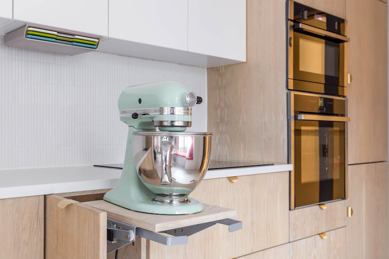
The owner, a big cook and baker, can call on additional counter space in the form of a Hafele small flip-up unit that has been designed to accommodate bulky items such as her KitchenAid at a level that works. The appliance lift gives additional space.
Breakfast station
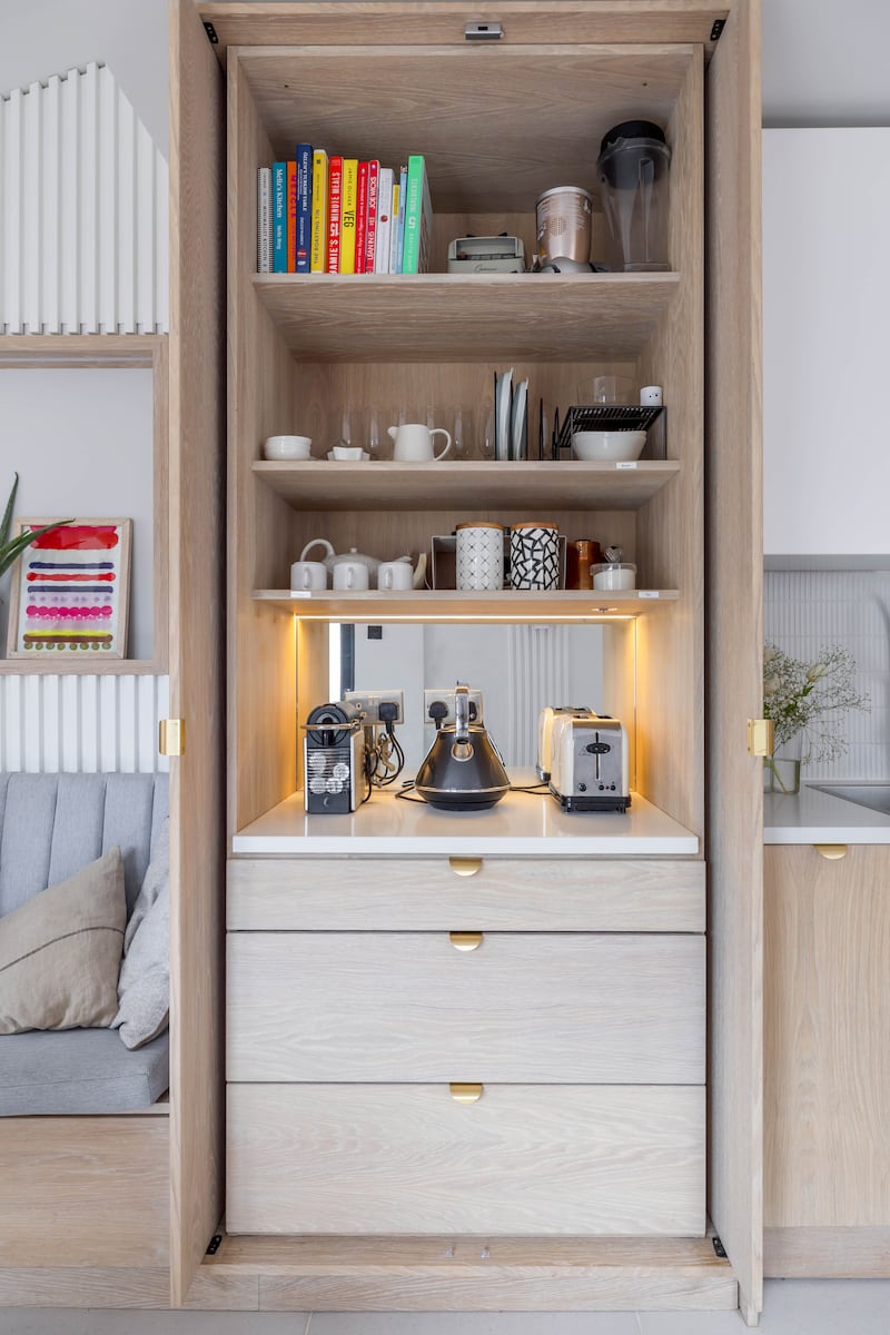
Much of the countertop clutter in a home is related to breakfast. The pocket doors hide a breakfast station, where there’s room for the toaster, coffee maker and kettle to all live out of sight. In the drawers below there is a cutlery drawer, and below it a Hafele bread bin, which includes a removable tray for pastries and a plastic roller top that keeps the baked goods fresh.
Chop chop chic
Above a utensil jug is a set of chopping boards hiding in plain sight. The Joseph Joseph Folio slim is a three-piece chopping board set, colour-coded to help prevent cross-contamination between different foods. It comes with clips to affix it to cabinets and shelves. “I wanted every unit to have an exact purpose and an exact location,” she explains. It also helps declutter the quartz countertop.
A bench for kids to hang out
An upholstered bench with storage underneath is designed as a “place for kids to hang out”, she says. “They won’t sit at the table. Kids don’t do that.”
- Sign up for push alerts and have the best news, analysis and comment delivered directly to your phone
- Join The Irish Times on WhatsApp and stay up to date
- Listen to our Inside Politics podcast for the best political chat and analysis


