Back when Barack Obama’s star was only ever in the ascendant, the designers who put together the look of his run for the US presidency chose a very particular visual style for the campaign. One selection was the glossy blue that appeared on everything from his posters, badges and pamphlets to his website – “in line not only with being kind of American and this great hopeful color, but aligning him to the Democratic side of politics”, according to Scott Thomas, Obama’s design director. They also chose a typeface to help create an identity for their relatively unknown candidate, who was still in his first term in the US Senate.
So “Yes we can”, “Change we can believe in” and the campaign’s other slogans from 2008 appeared in Gotham, a typeface designed at the turn of the millennium for GQ magazine, based on neon lettering, shopfronts and other public typography around New York. It was a great choice, according to the design critic Alice Rawsthorn, who wrote in the New York Times that it conveyed “a potent, if unspoken, combination of contemporary sophistication (a nod to his suits) with nostalgia for America’s past and a sense of duty”.
If the hope of a country seems too much responsibility to load on to a typeface, particularly one that made its first appearance only a decade ago, stop to think about how quickly other typefaces can trigger an association. You need only a glimpse to recognise Coca-Cola’s logo or know that you’re near a McDonald’s.
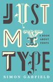
That’s part of the reason why Simon Garfield has written this punchy and entertaining overview of typography. After producing a dozen other nonfiction books, with subjects ranging from the invention of mauve dye to the Mini car, he has become fascinated by the way typefaces can not only convey information but also help shape our responses to it. Just My Type zips from Johannes Gutenberg’s mastery of the principles of mass-produced type, for the Bibles he printed from the 1440s onwards, through 20th-century classics to more recent creations, such as Dirtyfax, whose wackiness makes it almost illegible.
100 great restaurants, cafes and places to eat in Ireland 2024
Bill Nighy: ‘My grandmother kind of raised me. She was a proper Irish woman, a Catholic. I was to be a priest’
Netflix, Prime Video, Disney+, Apple TV+: 10 of the best new shows to watch in November
‘There are times I regret having kids. They’re adults, and it’s now that I’m regretting it, which seems strange’
As Garfield explains, although designers have sometimes wanted to use hard-to-read styles, legibility is a key consideration for most typographers. It was certainly central to the work of Edward Johnston, a calligrapher, for London Underground: as the first World War raged he was developing the now iconic Johnston Sans, for use on Tube signs, which contributed to public life by helping people get around the British capital.
As Garfield points out, other organisations have commissioned their own typefaces, too, notably the Times newspaper of London, whose Times New Roman, designed by Stanley Morison in the early 1930s, later became the default typeface for many incarnations of Microsoft Word. In 2007 Microsoft switched to Calibri, a much more modern design that was intended to be clearer on screen. The change hardly rocked the world, even if Calibri suddenly became the world’s most widely used typeface.
On the other hand, Garfield points out that when, last year, Ikea abandoned Futura, a version of which had appeared in its catalogues for 50 years, in favour of Verdana – another Microsoft typeface – “there was rudeness on websites. Newspapers wrote about it in cutting ways, and there were frank exchanges on BBC radio”. Even the New York Times and Time magazine covered the story. But then Ikea distributes almost 200 million copies of its catalogue each year, meaning that every decision the company makes about its look can alter its corporate identity and, therefore, its relationship with its customers.
All of which emphasises that you need to be careful when you choose a typeface. Back when Obama’s campaign team chose Gotham, Hillary Clinton opted for New Baskerville, which Gotham’s designer, Tobias Frere-Jones, calls a “snooze of a serif” that “might have come off a heart-healthy cereal box, or a mildly embarrassing over-the-counter ointment”. And John McCain? He went for Optima, used on Yves Saint Laurent perfume and Marks & Spencer packaging, and which Garfield describes as so beautiful that it can “withstand a prolonged period of admiration”. Again, Frere-Jones isn’t so complimentary, referring to it as “the font of choice for the hygiene aisle”. Garfield isn’t so cruel as to highlight such gloating. But his intriguing book can send you online to look more deeply, typographically speaking, into the character issue.


