"It's a very tricky question," says architect Roberto González, when asked how the original Bauhaus style has influenced the design of the new Bauhaus Museum in Dessau, Germany.
“We wanted to create a certain distance while showing respect for the Bauhaus... it is a reinterpretation of the architecture: clear lines; austere materials like concrete, glass and steel; simple forms.”
The Spanish architect was speaking just before the museum's official opening by German chancellor Angela Merkel on September 8th. With the Bauhaus celebrating its centenary this year, the museum will permanently display a collection of design movement's work and will act as part of its lasting legacy. The anniversary is being celebrated throughout Germany with events and exhibitions, as well as internationally in most major galleries and museums (including a print show in the National Gallery of Ireland).
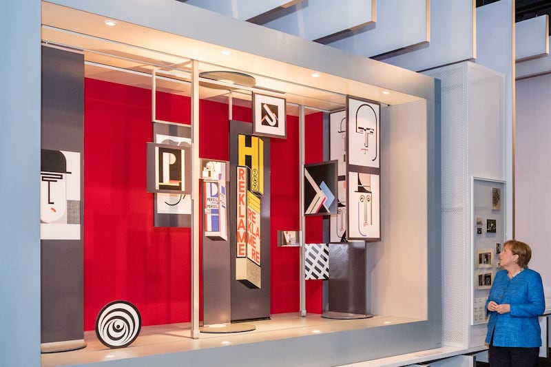
Less than two hours by train from Berlin, Dessau was home to the Bauhaus school from 1925-1932 after it had been ousted from Weimar, where it was founded by Walter Gropius. It then moved to Berlin for a final year before the Nazis, always suspicious of the institution’s radical views, finally succeeded in closing it down. The period in Dessau was the longest in the school’s 14 year history and is recognised as its most productive. The city is most famous now as the location of the Bauhaus school building – a pilgrimage site for architects – designed by Gropius and encapsulating the movement’s guiding theories: form following function, minimalist natural materials and functional, stripped back design.
From the street, the new museum building presents as a vast glass box, 105m long, 25m wide and 12m high, one side facing a busy shopping street in the centre of the city, the other a municipal park. Both landscapes are reflected in the glass walls. The “fifth wall” is, says González, the green roof, planted for insulation and visual appeal.
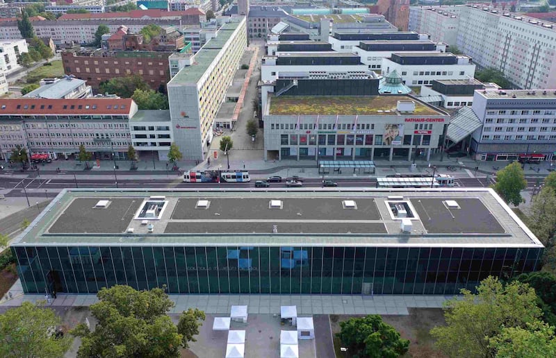
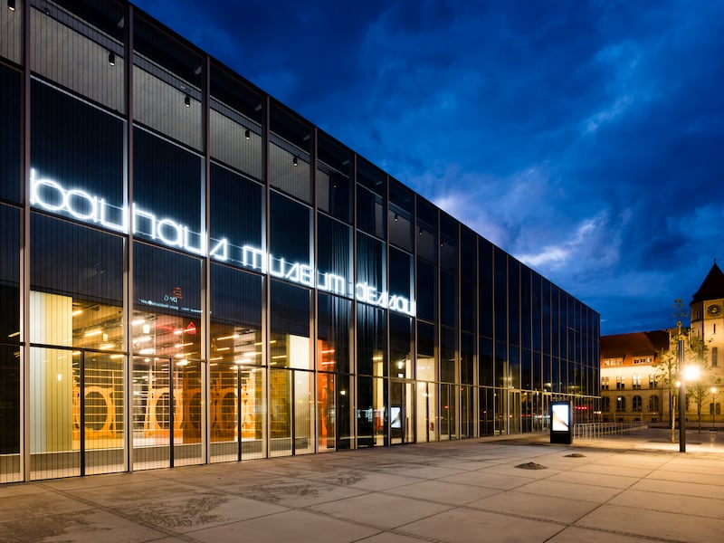
“It is a glass envelope,” says González of the museum’s exterior, “the main concept is the black box.” Inside on the first floor, hovering about 5m above visitors’ heads, is an enclosed black concrete box – a building within the glass-walled building – with 1,500sq m of exhibition space. Taking inspiration from bridge builders, González and his team at Barcelona-based Addenda architects designed the 100m-long concrete box to rest on two stairwell shafts, 50m apart with no intervening supporting pillars. The two ends of the box project over the stairwells allowing for offices, meeting rooms and services underneath.
Beneath the main part of the box is a vast exhibition space at ground floor – without pillars – with a schedule of events and contemporary exhibitions programmed to encourage Dessau locals to come in. "We are in northern Europe where it rains a lot and gets very cold," says the young Spanish architect of the glass walls. "So we built a kind of a winter coat [for the black box] made of glass." The building is, says González, the biggest building that could be built for the €28 million budget. And it's been a relatively fast build. The Bauhaus Dessau Foundation held an international architecture competition in 2015 for a new museum.

With more than 49,000 objects in its collection ranging from furniture to architectural plans, student notes and teaching plans as well as prototypes and artworks, its requirements centred around significant exhibition space.
Out of 831 submissions Addenda won the commission, the collective of Spanish architects only coming together for the bid.
“There were two main challenges,” says González, “the German language, and trying to do something out of the ordinary in a country where every aspect of life is standardised.”
The black box idea is certainly not standard – in exhibition terms anyway. “It was daring,” says Claudia Perren, director of the Bauhaus Dessau Foundation noting that white walls are the norm. There is however, she says, also a practical reason for the all-black interior. No natural light gets in and the curators can devise lighting that does not damage the collection, which includes many fragile original documents and drawings.
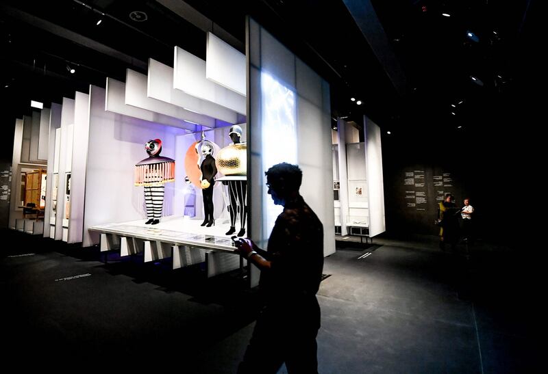
The first exhibition, Versuchsstätte Bauhaus:The Collection, describes Bauhaus as a vibrant place where people taught and learned, conducted artistic experiments and worked on industrial prototypes. To explain its teaching methods, it pairs the work of some of its well-known masters, including László Moholy-Nagy, Wassily Kandinsky and Paul Klee, with some lesser-known students.
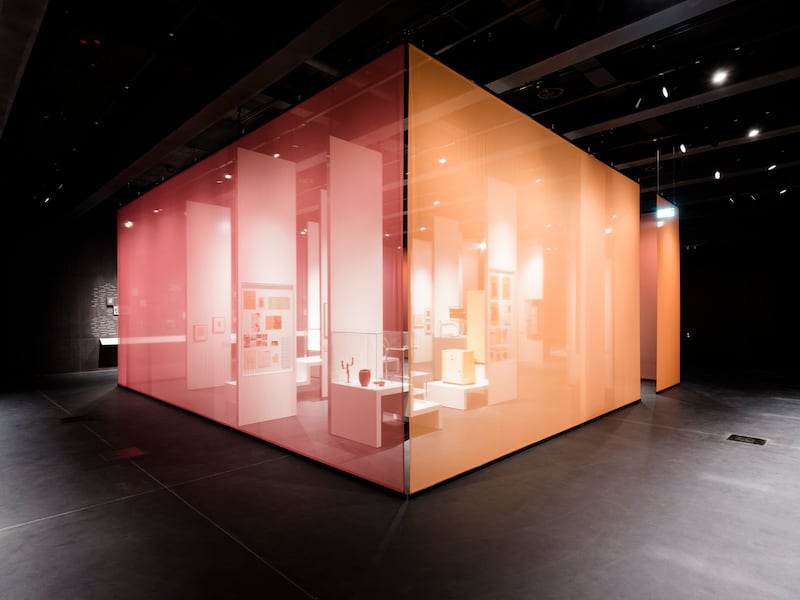
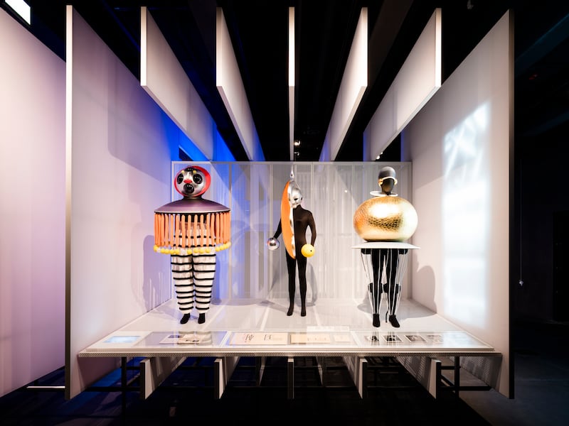
The space is divided into several display sections, including a series of mini-stages (one features designs for one of the school’s legendary costume parties); a room within a room, its “walls” made by sheets of metallic fabric; and an orange painted metal display unit working as a massive room divider.
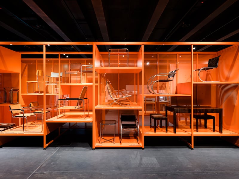
One section explores how some of the Bauhaus ideas, such as “Can advertising be art?”, “How to design with light?” and “How to sit on air?”, were explored by both masters and students. The latter question is shown alongside the prototype of Marcel Breuer’s now famous tubular steel Wassily Chair, in which the designer stripped the chair to it essentials, a frame and a seat, and used industrial materials.
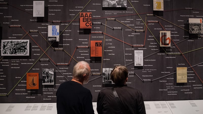
A “Bauhaus as Network” section – an elaborate tracing of coloured strings, photographs and names – links students and teachers with the different countries they were forced to flee to in 1933 when the school disbanded, and shows why the school’s theories on art, architecture and design became so influential globally.
There’s a section devoted to the Bauhaus weaving workshop – with a highlight being Grete Reichardt’s strikingly modernist wall hangings and carpets. While the Bauhaus was seeking a new and advanced way of living with its design principles, its attitude to its female students was less than progressive. Roughly an equal number of young men and women enrolled in Dessau and undertook a foundation course – a radical concept then for an art school – exposing them to every aspect of design, from theatre sets and architecture, to metalwork and dance. But when it came to choosing a speciality in the second year of the practice-based course, men could chose from a wide range of craft skills, including carpentry, typography and metal work, while women were funnelled into the weaving workshop. Reichardt and her colleagues were so productive and their work so immediately desirable theirs was the only workshop to turn a profit.
As a visitor experience, an exhibition space where walls, floor and ceilings are black concrete is challenging, on two fronts. With 1,000 exhibits chosen from the foundation’s collection in the opening exhibition, it demands a long visit. Yet the all-black environment begins to feel oppressive after a while. Then there is the obvious point that light and space are key characteristics of the Bauhaus movement. Gropius’s Bauhaus school building, the physical manifestation of his architectural theories, is a series of light-filled rooms characterised by white walls and ceilings with vast metal-framed windows. With this in mind, Addenda’s Black Box could be viewed as a provocative gesture.
The museum’s glass walls, argue the foundation, make it possible for anyone to look through from one side to the other, from the street side to the park, and make it an accessible building for locals, although perhaps they underestimate how forbidding a vast wall of glass with a discrete entrance can be.
Located in the town centre, the new museum is 2km away from the Bauhaus area – the Unesco world heritage site that encompasses the Bauhaus school and the nearby masters’ houses, designed by Gropius as living and work spaces for himself as the school’s director and his key staff: Klee, Kandinsky, Moholy-Nagy, and Oskar Schlemmer. A bus shuttles between the museum and all of Dessau’s Bauhaus sites.


